
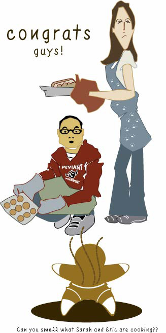
So a special congratulations to my friends Sarah and Eric on their upcoming bundle of joy. Hopefully it will not resemble the evil gingerbread man featured in the above picture.
This pic makes me kinda happy after the brutal work critique I was faced with earlier. In which the words: appreciate the effort, dinosaur, and concerned about modern feel were used. My design was smote amongst 4 business types and I felt like a seal that had lept into the tiger shark tank with a blindfold on. Sadly I was advised to make the piece in such a manner in the first place. And the final product resembled my very first Word assignment that I did in like 5th grade. I.E. classical feel means times new roman in 18 point font. CENTERED.
Sigh, why design when you have starbursts, caps, and centered features. Why try.
Harumph...
5 comments:
I LOVE LOVE LOVE the design! Sorry about the suits being suits...
-Sarah
I feel your pain, electronic friend. I often have to make newspaper ads for one of the radio stations I work for, and you can GUARANTEE that whatever I originally come up with will be slashed by at least 80 percent.
My beautiful flower gets stripped to a naked stem with COMIC SANS and a few starbursts. Cause people won't know what to really focus on if there isn't a starburst lighting the way, you know.
That reminds me of the scene in Cinderella where the step sisters rip her clothes off when they see how beautiful she is. I'm used to smoting, but the scope and range of today's smoting was BAD. And it was for something as simple as a plaque.
gonna get started on my next cartoon to dull the ache of aweful critique.
I like the evil gingerbread man....but...um....does he have gas? Or is he still smokin fresh from the oven? What are those lines coming up from behind?
The evil lines are coming from the Gingerbread pamper.
Post a Comment